In our mid-year update, we review the performance of the Bianco Research Total Return Index and the ETF that tracks it, the WisdomTree Bianco Fund (WTBN). We also highlight a method for measuring the fair value of bonds and explain why President Trump’s demands that the Fed cut rates can lead to higher long-term yields.
Review
We manage the Bianco Research Total Return Fixed-Income Index. You can find more about it here or on Bloomberg at BTRINDX <Index>.
A reminder: we manage our index discretionarily, or “tilt,” by over- or under-weighting various characteristics. Our latest tilts and their rationale can be found here.
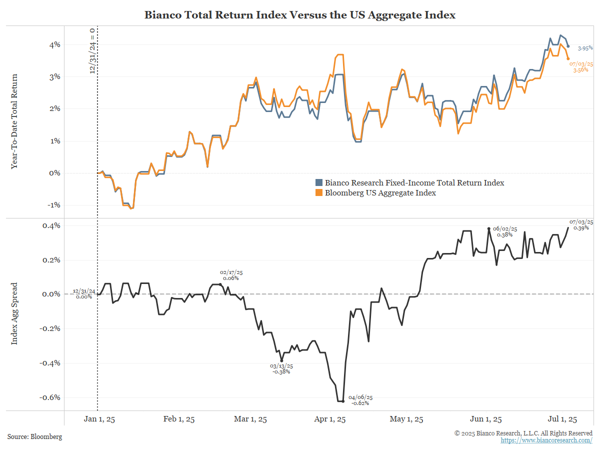
As the following chart illustrates, our index (blue) outperformed a broad investment-grade benchmark, the Bloomberg US Aggregate Index (orange), by 39 basis points (black) in the first half of 2025. Our index outperformed the Bloomberg US Aggregate by 146 basis points in 2024.
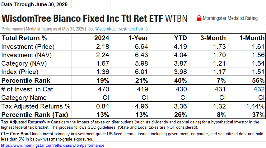
Morningstar categorizes WTBN as a core bond fund, alongside approximately 430 other funds. For the first half of 2025, WTBN ranked in the 26th percentile on an after-tax basis, meaning it outperformed 74% of this universe. For 2024, its tax-adjusted return was in the 13th percentile (outperformed 87% of the universe).
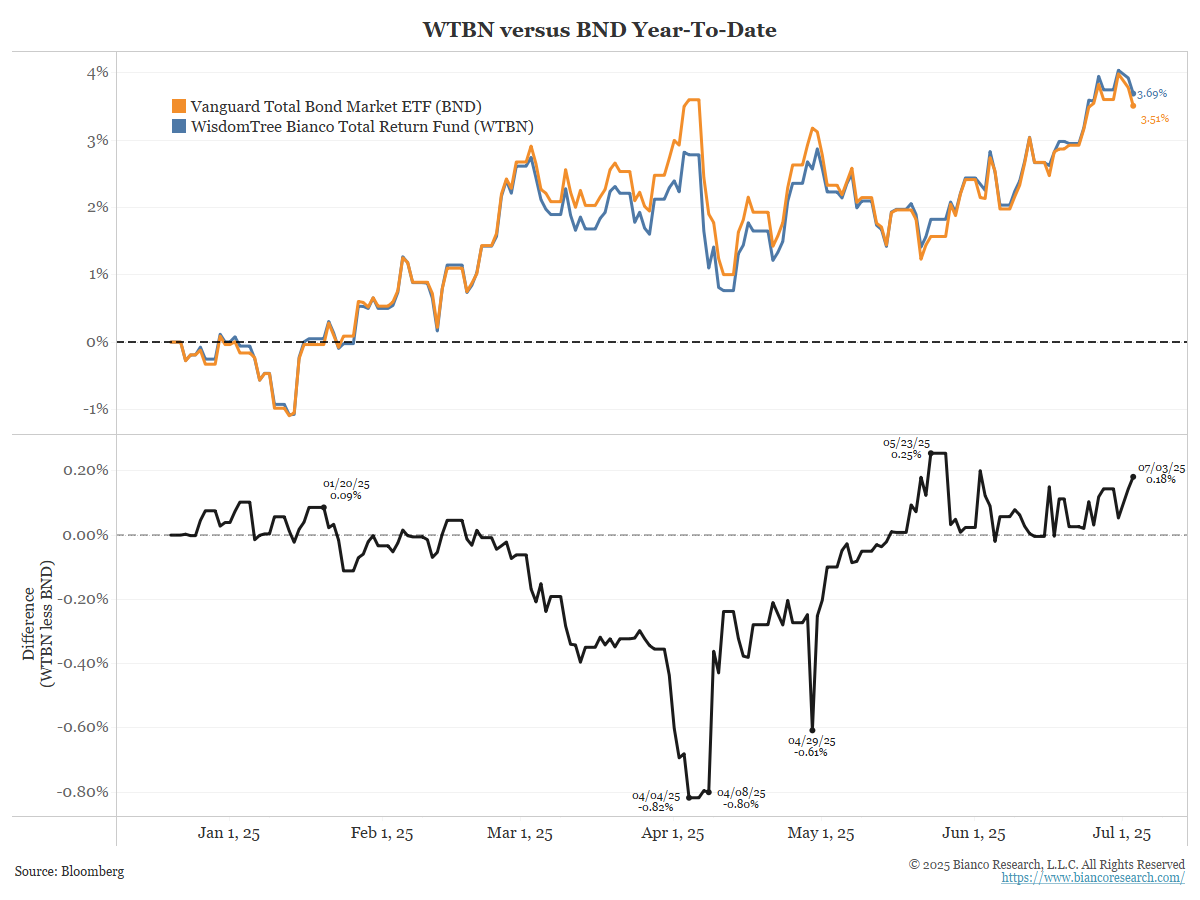
The WisdomTree Bianco Fund (WTBN) tracks our index, much like the Vanguard Total Bond Market ETF (BND) tracks the Bloomberg US Aggregate Index. As the next chart shows, WTBN (blue) outperformed BND (orange) by 18 basis points (black) in the first half of 2025. In 2024, WTBN outperformed BND by 98 basis points.
Actively Managed Bond Funds Work!
Some may doubt the ability of actively managed funds to beat a benchmark. Few equity funds can consistently outperform a benchmark, such as the S&P 500, but fixed-income funds are an exception. S&P publishes its “Index versus Active” report, known as SPIVA, twice yearly. The latest data covers the year-end of 2024.
In the table, red denotes that less than 50% of funds outperformed, and green indicates that more than 50% of funds outperformed. Bold is between 40% and 60% (effectively 50/50).
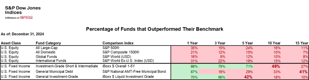
None of the equity managers in the broad categories outperformed their benchmarks over any time horizon out to 15 years (all red). But, many fixed-income managers did, or were close (green and bold).
Last year, we wrote an op-ed for The Financial Times, offering reasons why active fixed-income managers can beat a benchmark while equity managers find it much harder.
- The Financial Times (May 9. 2024) – Jim Bianco: The total return strategy in bonds is far from dead
The end of the historic bull market in the asset class just means a different approach is needed from investors
In equities, your biggest weightings are the all-stars. Think of the Magnificent Seven stocks. Equity managers cannot beat an index fund if they are not always all-in on the all-stars, and most are not. However, in the bond market, the biggest weightings are often the problem children, such as overleveraged companies, low-coupon mortgage securities, and countries that borrow too much debt. Recognising problems and sidestepping them produces big rewards. The fact that most managers have beaten a benchmark index confirms this. The new era just needs a change of style with more focus on coupon protection and risk assessment.
The Fair Value of Bonds
The chart below shows the 10-year yield (orange) and the yearly growth rate of nominal GDP. These two series do a reasonable job of following each other.
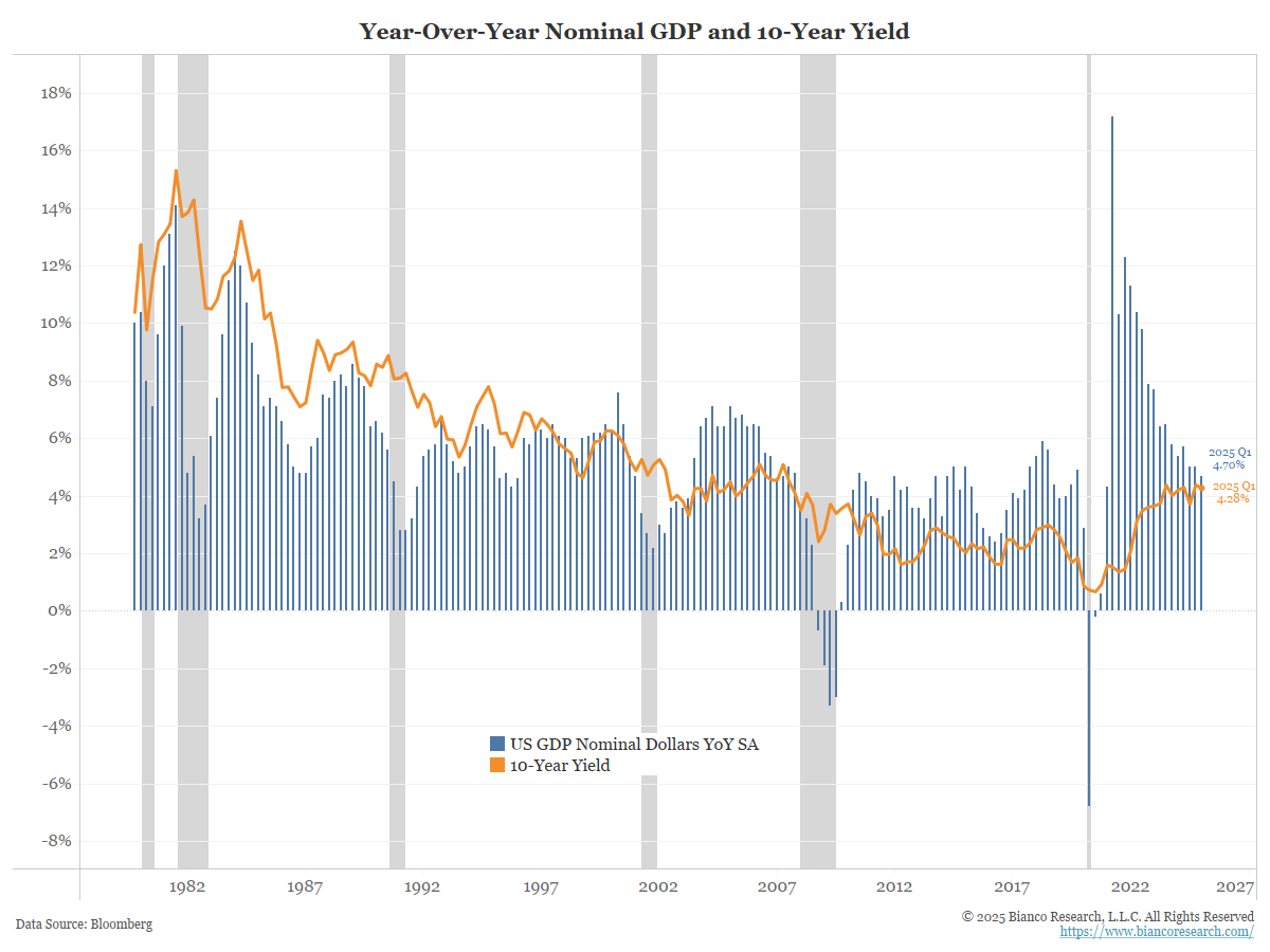
The nominal GDP measure above is the actual growth, or what just happened. Markets, however, are forward-looking. They anticipate what will come next.
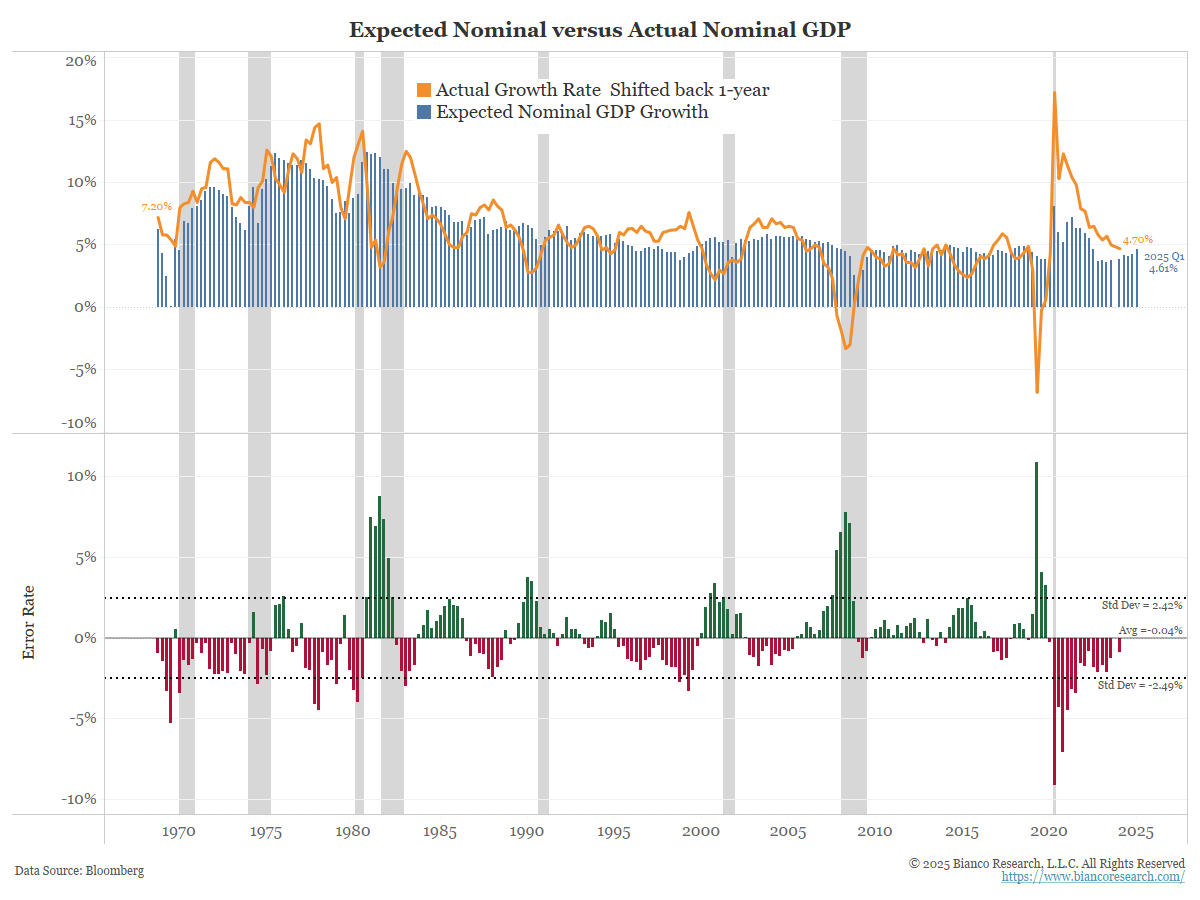
The Philadelphia Fed survey of professional forecasters also asks respondents to provide a forecast of nominal GDP for the upcoming year. This is shown below. The expected nominal growth rates from this survey are shown in the blue bars below. The orange line is actual GDP growth (same as the blue bars above). Actual nominal GDP has been shifted back a year to align with the forecasts (what the forecasters predicted a year ago versus what actually happened).
The bottom panel shows the difference or the error rate. The error rate averages nearly zero (-0.04%). In other words, the actual nominal GDP forecast is close to the expected nominal GDP forecast.
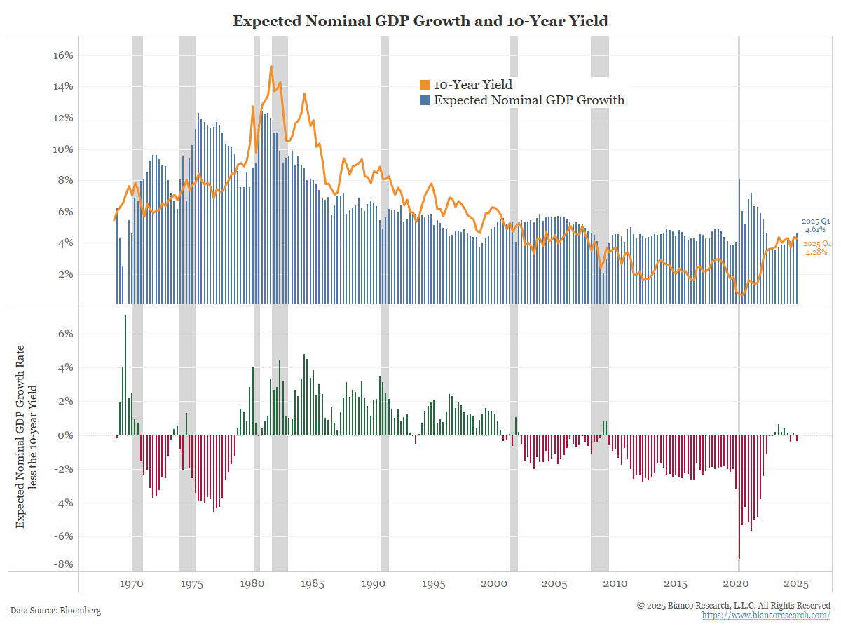
Therefore, when we display the survey’s one-year forward nominal GDP forecast (blue bars below) and the 10-year yield (orange line), we obtain the chart below. The difference is shown in the bottom panel.
Over the next year, nominal GDP is expected to grow at a rate of 4.61%. At the end of Q1 2025, when this forecast was last made, the 10-year was 4.28%. The 10-year yield is currently between 4.40% and 4.50%.
In other words, the 10-year yield, currently at 4.40% to 4.50%, is where you should expect it to be based on the expected nominal GDP forecast of 4.61%.
Real Rates Explaining the Error Rate
Real yields are an expression of risk. So, not surprisingly, they reasonably explain the consistent error rate of the red/green (expected nominal GDP less 10-year nominal yield) bars.
When 10-year yields are consistently above the expected nominal GDP, we also find high and positive real yields. The opposite is often true: when 10-year yields are consistently below expected nominal GDP, we also see low or negative real yields.
TIPS Versus Actual Real Yields
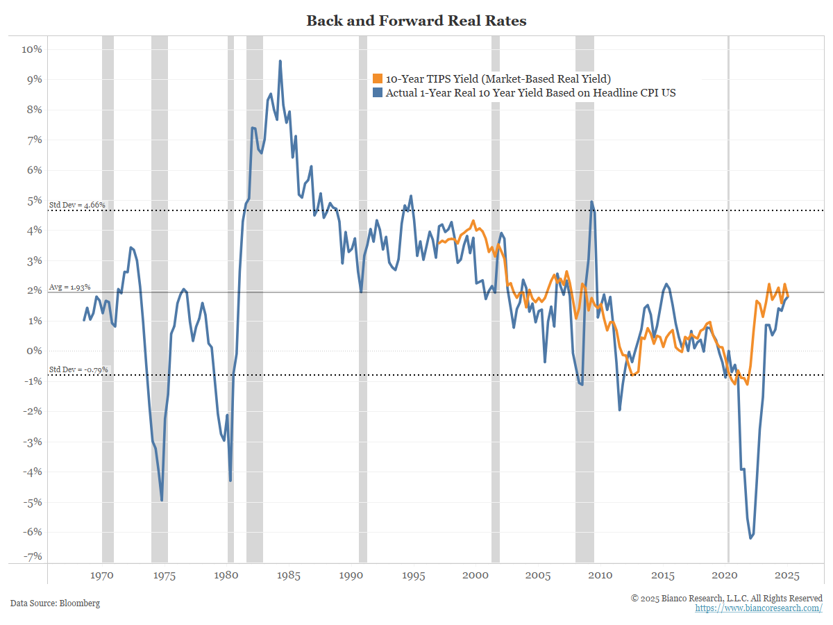
The blue line above is the same as the blue line below, showing real 10-year yields. Back in the late 1960s, the average real 10-year yield was 1.96%. The current level, at 1.9%, is near this long-term average.
Since the late 1990s, the U.S. Treasury has been issuing Treasury Inflation-Protected Securities (TIPS). The yield on this security is the market’s assessment of real yield. This is shown in orange below. The argument is that the real 10-year yield (blue line) is actual, while the TIP yield (orange) is forward-looking. We agree with this.
The TIPS yield and the real 10-year yield track each other closely, much like actual and expected nominal GDP. So, TIPS are both a good proxy for where real yields are and where they are expected to go.
Conclusion
The economy’s actual nominal GDP growth through Q1 2025 was about 4.7%. The 12-month forecast is for a similar 4.61% growth.
All of this suggests the current level of the 10-year yield, around 4.40% to 4.50%, is not restrictive or “too high.” Despite this, many analysts and market pundits continue to hyperventilate that yields are too high. What drives this thinking?
We have long held the opinion that the period between 2009 and 2022 was one of the most unique periods in the history of the bond market. It was the era of Quantitative Easing, which led to negative interest rates. Nothing like this was seen before 2009.
The problem is that many still think this period was “normal.” So they constantly look for a return to this. When will our bond yields go back under 2%? When will the Fed cut rates to zero again? How soon until another round of quantitative easing begins? The latest “All-In” podcast, one of the world’s largest, asked these exact questions a few days ago, saying the thought of 2% bond yields and zero funds was still “normal.”
We would argue that the era is over. It worked because we were at the end of a long disinflationary period, which ended with the onset of the COVID-19 pandemic. We have too much inflation to expect this to happen short of another global financial crisis-level recession. We are seeing no signs of that happening.
What Happens If the Fed Cuts Rates?
On June 30, President Trump posted the following image to social media. It was a handwritten note to Jay Powell.
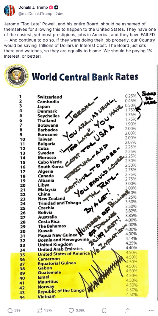
The market is looking past this view, as the Fed is unlikely to cut rates this drastically. But if Trump gets a Fed Chair to make 1% happen, how would the 10-year react?
This is a reminder of what happened to long rates last year when the Fed cut rates (peach arrow) and the market did not think it was a good idea (cyan arrow).
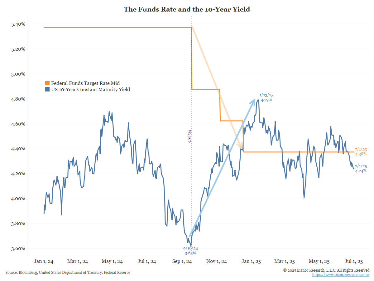
Long-term yields “rejected” the rate cuts last year by rising. As the next chart shows, this was one of the largest in 60 years. Last year’s rise in the 10-year was the second largest in the previous 58 years.
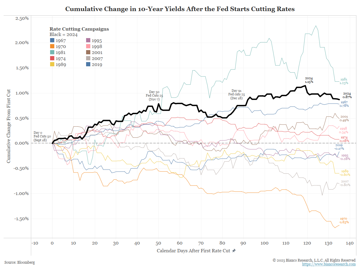
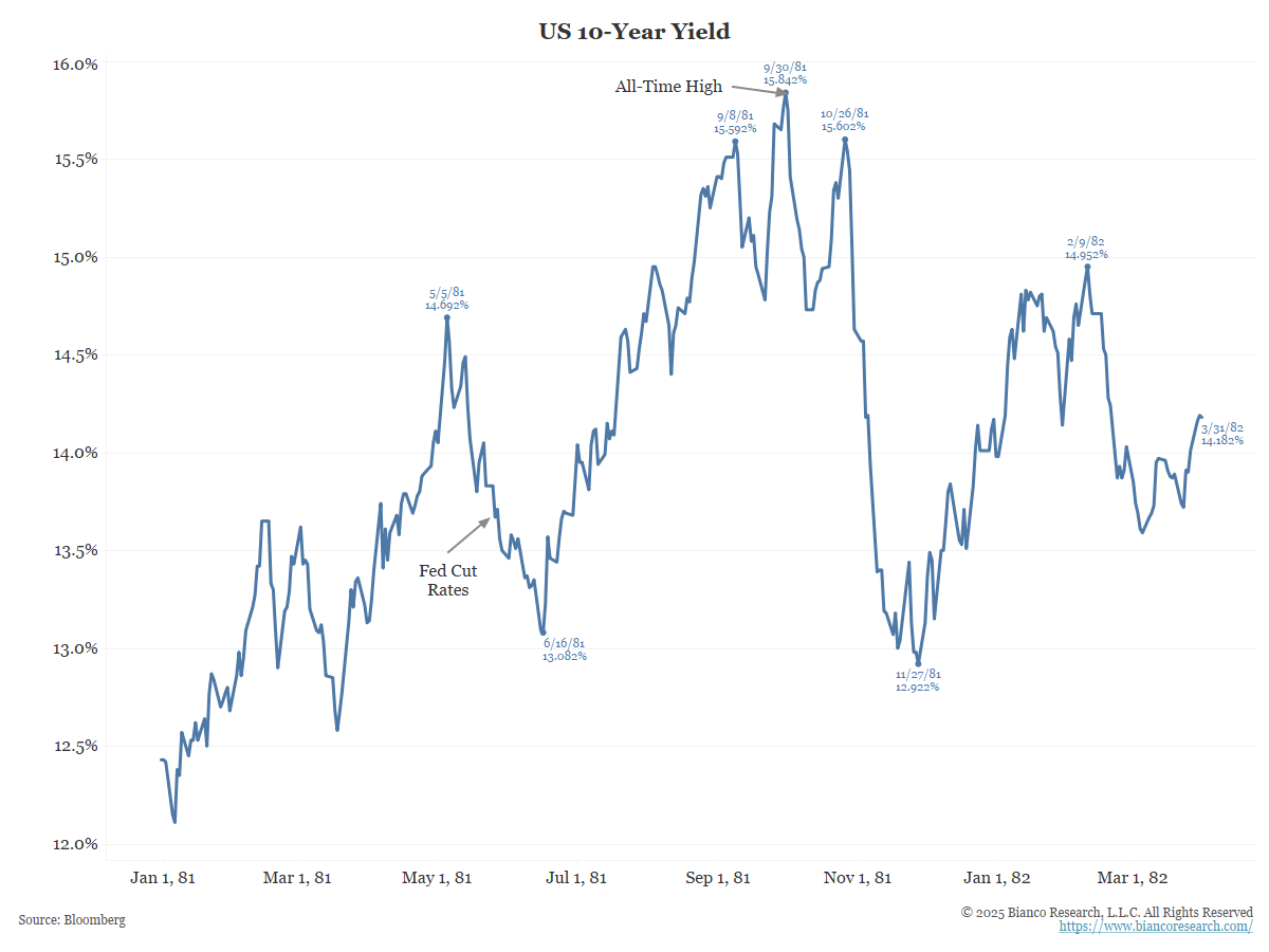
Only the 1981 cut (which started in May 1981) saw a bigger rise in yields. But note that in 1981, yields were 13%. Therefore, we would argue that a move from 13% to 15% is not as significant as a move from 3.6% to 4.8%, which is what happened last year.
Why is Trump demanding rate cuts?
As the next chart shows, interest costs (blue) are too high, exceeding defense spending (orange), which economic historian Niall Ferguson warns about (as indicated on the chart).
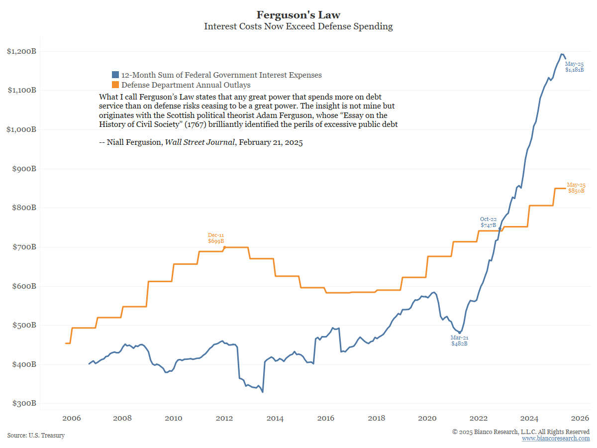
The problem with Trump’s argument is that he assumes interest rates are “made up.” So, he would like the Fed/Jay Powell to “make up” a lower interest rate.
He wants this so interest costs will fall. But see the chart above, the last time the Fed cut rates (last year), long-term yields soared, and interest costs rose.
This is because yield levels are not “made up.” Fundamentals such as inflation expectations, growth outlooks, and supply needs contribute to the fair value of yields, or nominal GDP, as detailed above.
Bond yields are not out of line with the economy. Cutting rates risks putting them out of line.
In the bottom panel above, note that the bars are green from the 1980s to 2000. This means that the 10-year yield tended to be higher than expected nominal GDP growth.
Conversely, from 2000 to 2022, the bars were red or negative, indicating the 10-year rate was often lower than the nominal GDP forecasts.
Below, the red/green bars from above are overlaid on the 10-year real yield (blue line). That is the 10-year yield less year-over-year CPI.